First Example done together: A budget, expenses sheet (part 2)
Here the next steps to our expense/budget sheet.
Go to the first page if you haven't read it. If you want to download the budget sheet template directly go to the end of the page.
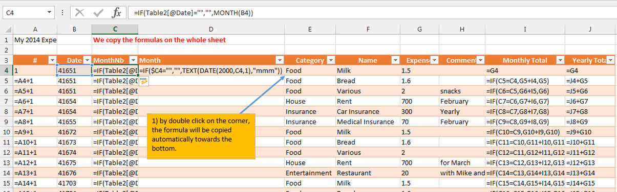
We do not need to write the formula on every line.... great!!!
By double click on the corner, the formula will be copied automatically towards the bottom.
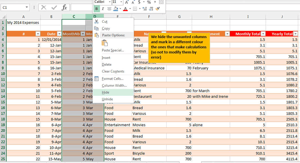
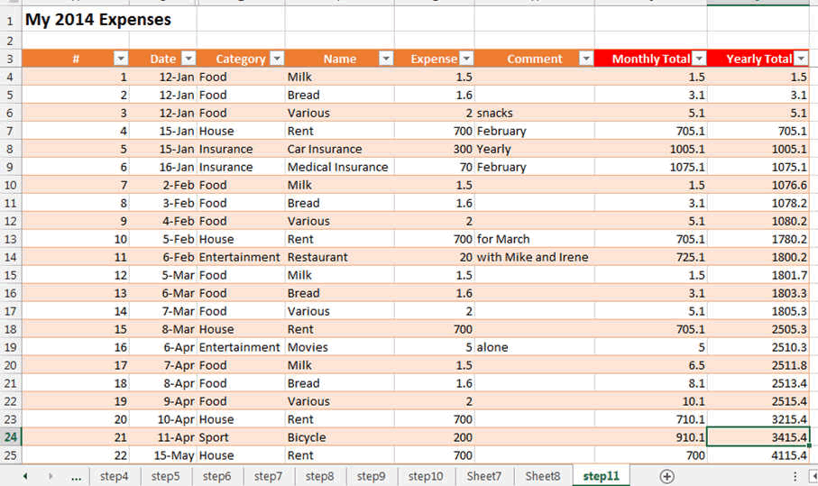
Now that we have entered the formulas in our excel budget template, we can hide the unwanted columns. To hide columns in Excel, right click on the columnsheader and press Hide.
We have also changed the color of the header for monthly and yearly. So that we can see them better.
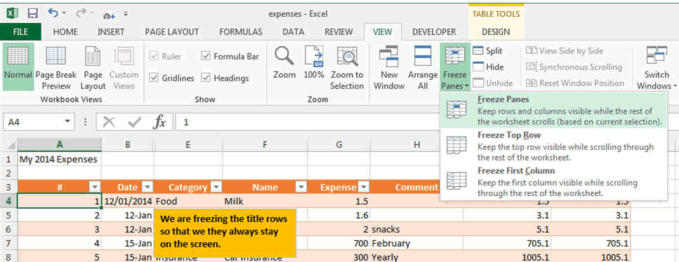
An important point is that you want to see your header all the time. Also when you have entered many many many expenses....
In Excel you can freeze the first row or first column (or you can also freeze more than one row or column in Excel). So lets do this by freezing the rows (and columns if you want). By clicking on the A4 Cell that you want to be frozen and then on the freeze pane button, we define the corner of the frozen zone. The Freezing of a column or a row or a cell is always keeping the cells to the left or higher than the cell Frozen.
You can also freeze the full row or column by selecting the row or column and press Freeze Panes.
Pivot Table and Charts
This are very important tools in Excel allowing you to sort, and juggle with data.....REALLY...
Pivot tables in Excel allows for sorting and combining data, calculating the number of occurences in a table, to see duplicates, etc...
There is a full chapter about pivot tables in Excel under this link.
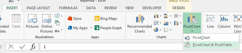
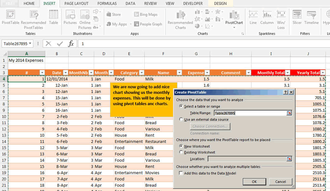
We are going to create an Excel Pivot table and chart. Select any point in the table and then press the Pivot chart button
The create pivot table window opens and asks you to confirm the table name (or range of the table sometimes). Enter a name or Press OK.
A new sheet opens. It will allow you to create a graph just by dragging the fields.
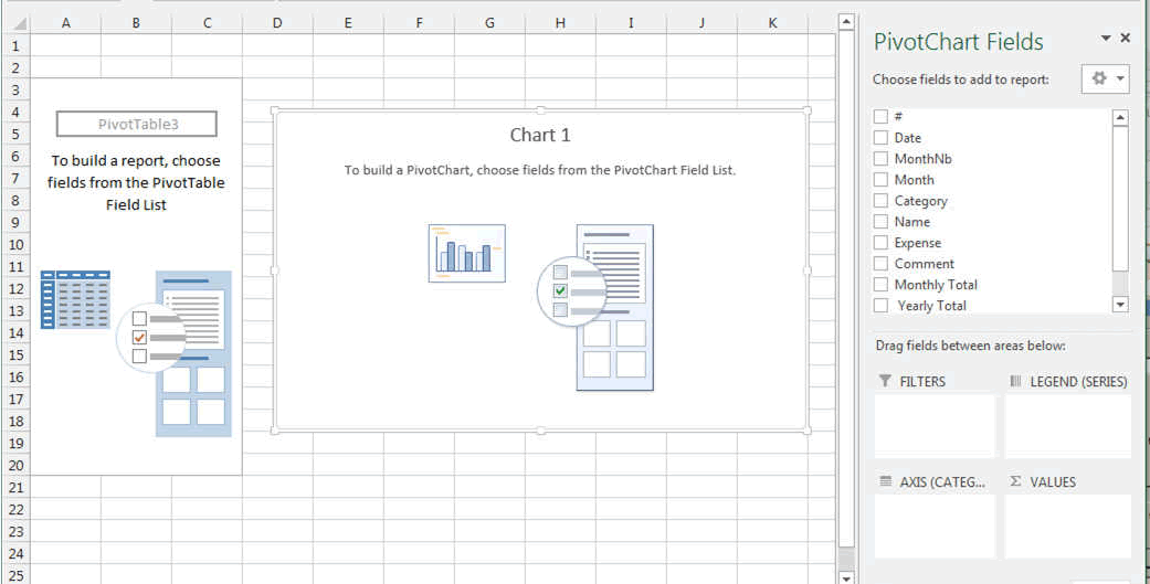
By dragging the Month and Category into the AXIS area and then the Expenses into the VALUE area you get already a table and a graph.
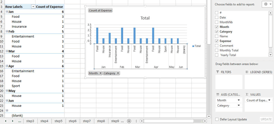
But... something is wrong with the graph. It show you the COUNT and you do not want the count but the SUM of your expenses.
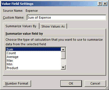
So by clicking on the small arrow to the right of the COUNT OF EXPENSES, you will get the following window.

ANd by selecting the last one "VALUE FIELD SETTINGS" you get to change the COUNT to SUM. COUNT counts the number of occurences and SUM makes the sum of these occurences.
ET voila....
The graph and table are correct. Showing you per category and per month your expenses.
If you add data in you entry table, then the Excel Pivot table will not refresh automatically. To refresh the chart, press ALT-F5.
Hope you enjoyed and learnt something....
Download the file here.